 09
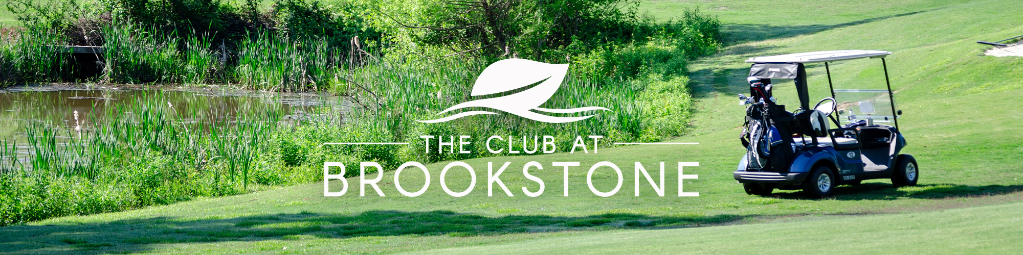
09 The Club at Brookstone
We created a lasting brand identity that would convey the multitude of opportunities available to members of The Club at Brookstone. They were in transition from just a golf club to a multi-faceted club with many different sports as well as dining.
- Client
- The Club at Brookstone
- Services
- Brand, Web, Photography
“There are no shortcuts on the quest for perfection.” – Ben Hogan
With this thought in mind, we attempted to create a lasting brand identity that would convey the multitude of opportunities available to members of The Club at Brookstone. They were in transition from just a golf club to a multi-faceted club with many different sports as well as dining.
Aa
The Club at Brookstone offers world-class amenities and an unparalleled experience for its members.
Aa
The Club at Brookstone offers world-class amenities and an unparalleled experience for its members.

Refining and polishing of an idea into a true gem.
The Club at Brookstone had the start on their logo. It had recently been incorporated into onsite signage. So we knew it could not be changed. However, there was room for refinement. We took the existing logo and made slight tweaks to greatly improve the overall appearance.
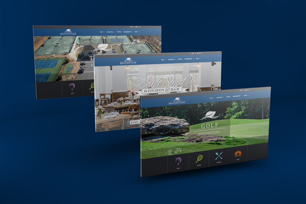
An interesting web design challenge...
The Club at Brookstone is a multi-faceted entity. They are one club that houses many separate amenities. Golf, Tennis, Dining, and Social activities all deserved their own space. To carve out equal space and attention for all these different venues, we built each their own site and unified them under one brand. This way each could operate independently and maintain some autonomy.